League of Legends, Summoner Icon case Study
Created by Riot Games in 2009, League of Legends is a game where two teams of five battle to destroy the other team’s base. With over 100 million players monthly, League of Legends is a clear success however, the game client itself needs more features that catered to the player. In this project, I critiqued the League of Legends client UI and presented a new interface feature.
Image from Riot Games and Blur Studios
CHALLENGE
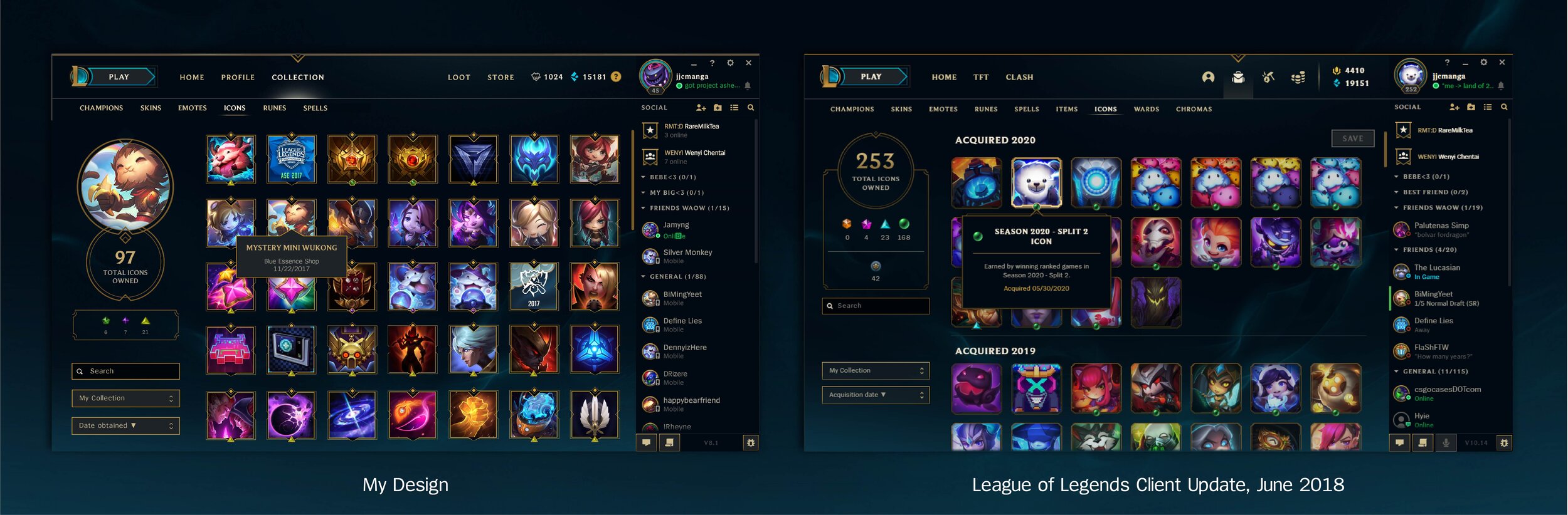
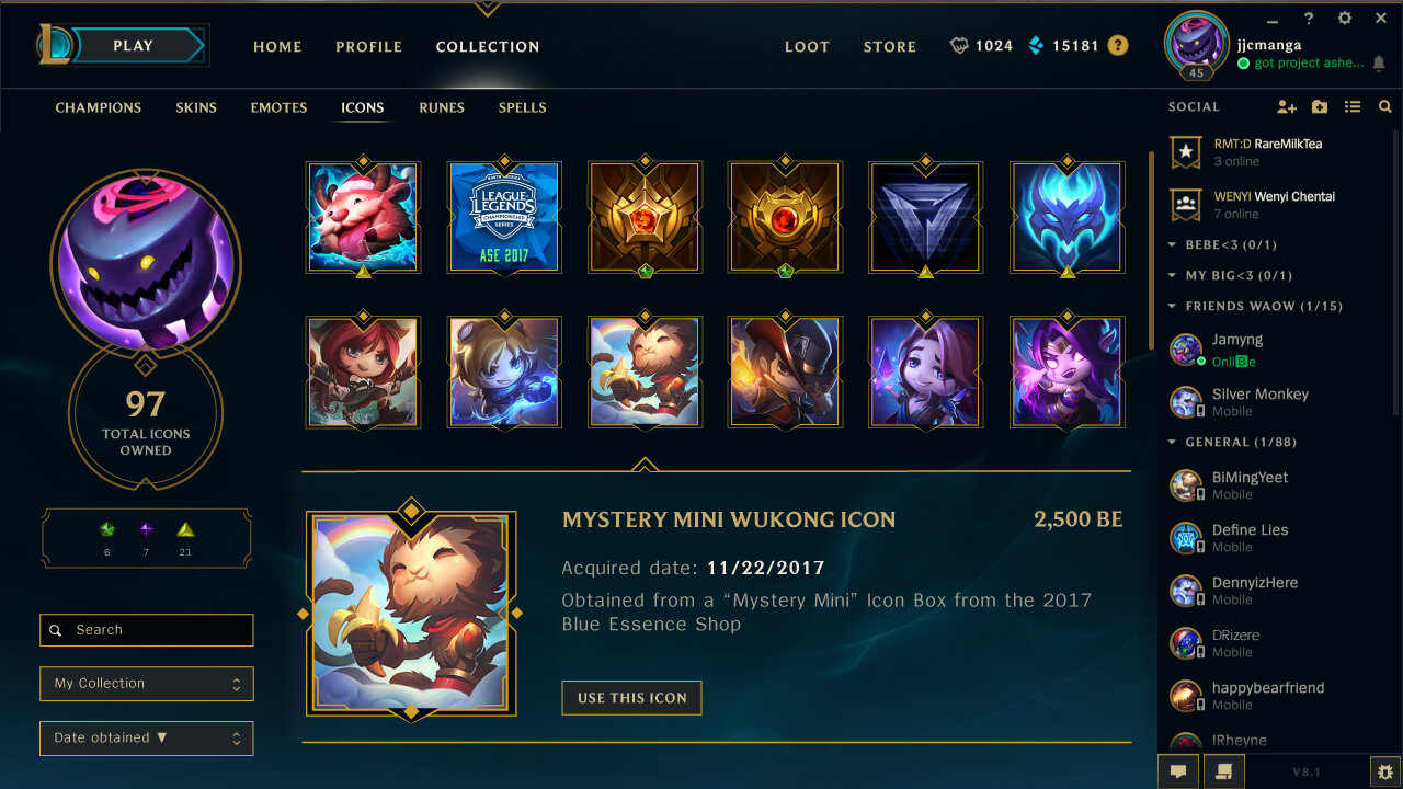
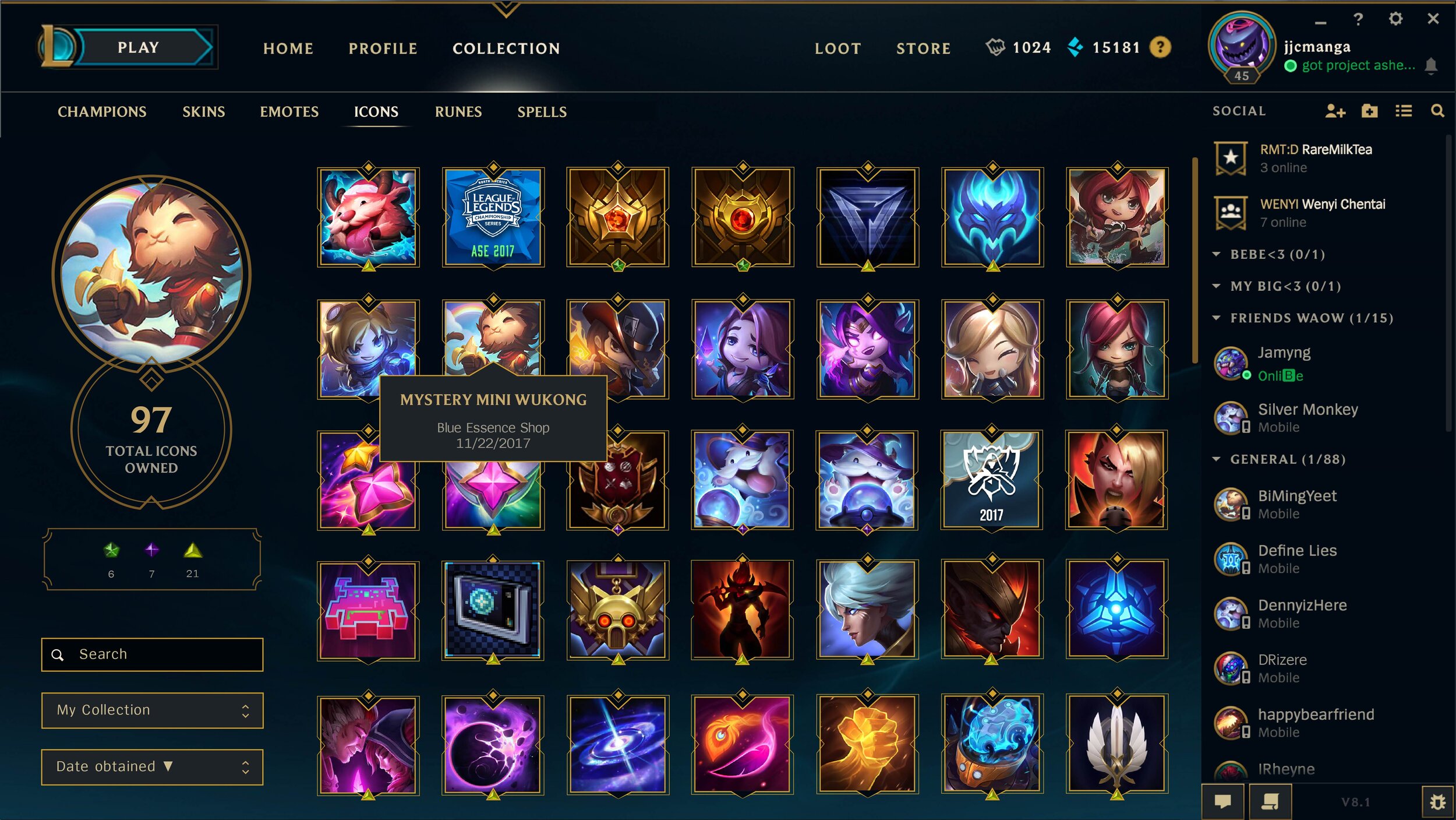
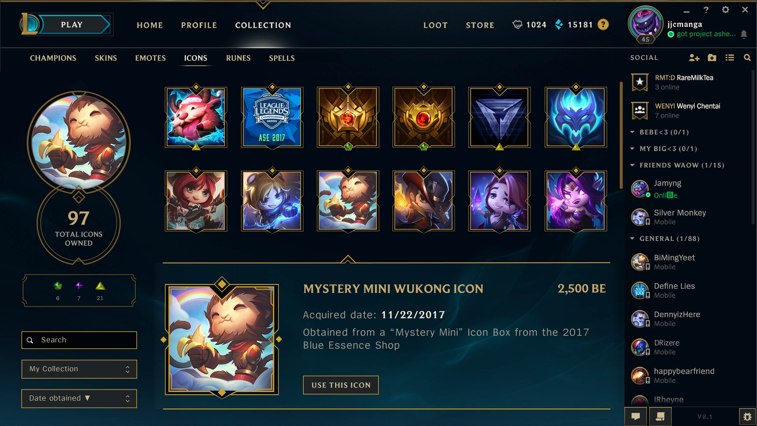
One popular feature on the League of Legends game client is the Summoner Icon Collection which features illustrated profile pictures. However, this interface has left much to be desired as it is unorganized and lacks QoL information. As an avid League of Legends player and designer, I wanted to explore new ways of creating a better player experience.
I reviewed community feedback and conducted guerilla interviews with players to discover what they envisioned for the Summoner Icon Collection:
Players can’t remember how they obtained icons
Design makes it difficult for players to find a specific icon
Players wanted a way to categorize the icons
Icons are too small to see
Comments taken from the League of Legends Subreddit
COMPETITIVE ANALYSIS
I compiled League of Legends artwork and gaming client interfaces that I wanted to critique and take inspiration from.

Images from League of Legends, Starcraft II and Steam
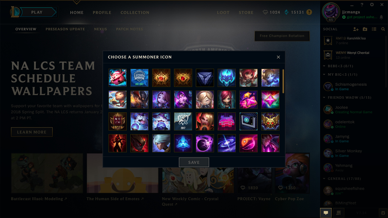
I created a userflow of the steps required to change a Summoner Icon and was frustrated with the inability to easily find the icon I wanted.
USERFLOW ANALYSIS: CHOOSING A SUMMONER ICON
INTERFACE ITERATIONS
After taking inspiration from competitors and critiquing the current player experience, I created sketches, wireframes and digital layouts.
SUMMONER ICON PAGE
This design fits the Summoner Icon into the client hierarchy and organizes the icons, making it easier for players to navigate around. It helps the player quickly find their icon of choice and has features including:
Icon Descriptions
Categorization
Bigger icon images
COMMUNITY FEEDBACK
I shared my design with Reddit and was excited when the League of Legends community interacted with it.
38,000+ views on Behance
1,700+ upvotes on Reddit
100+ comments on Behance & Reddit
After looking at comments from Redditors and Riot Games employees, I found areas of improvement:
Icons take up too much space
Clunkiness of Expansion Animation

Comments taken my post on the League of Legends Subreddit
SUMMONER ICON PAGE UPDATE
After receiving feedback, I designed a simpler layout that still addresses player pain points including organization and navigation. The updated design has smaller artwork and icon descriptions that are more in line with the League of Legends branding.
RIOT GAMES’ UPDATE TO THE SUMMONER ICON PAGE
Designing the League of Legends’ interface was not only a passion project, but an immense learning experience where I discovered that feedback should be taken with a grain of salt and if it’s not broken, don’t fix it. This project helped me grow as a designer and I will keep Riot Games’ motto, “player experience first,” in my head whenever I’m tackling a new challenge.
Credits
THANKS TO: Vivian Chung, Morgan Tieu